Building a Health Platform Part 3: Designing Views for Hundreds of Environments
The Series
This is part 3 of a 4-part series on building a health monitoring platform:
- Part 1: Architecture and Data Pipeline
- Part 2: Caching 12M+ Logs for a Real-Time Dashboard
- Part 3: Designing Views for Hundreds of Environments (this post)
- Part 4: From Health Logs to Grouped OpsGenie Alerts
The UX Problem
The data pipeline from Part 1 and the caching layer from Part 2 can serve health data for hundreds of environments in under 50ms. But fast data doesn't matter if the dashboard shows the wrong information to the wrong person.
Before this dashboard existed, checking service health meant knowing exactly which page to open. Each environment had its own healthchecker frontend running on its own domain. With hundreds of environments across multiple clusters, finding health information required knowing the cluster, the namespace, and the specific URL. There was no single place to answer "what's broken right now."
Different people need different views of the same data. An on-call engineer during an incident needs what's failing right now. An operations lead needs the global picture. A developer pushing a change wants their specific environment. I needed one dashboard that serves all of these without making any of them dig.
The Main Tabs
The dashboard is organized around four top-level tabs: Alerts, Environments, Clusters, and Services. Each tab is a different lens on the same underlying data. They're not a hierarchy where you drill from one to the next. They're independent entry points for different questions.
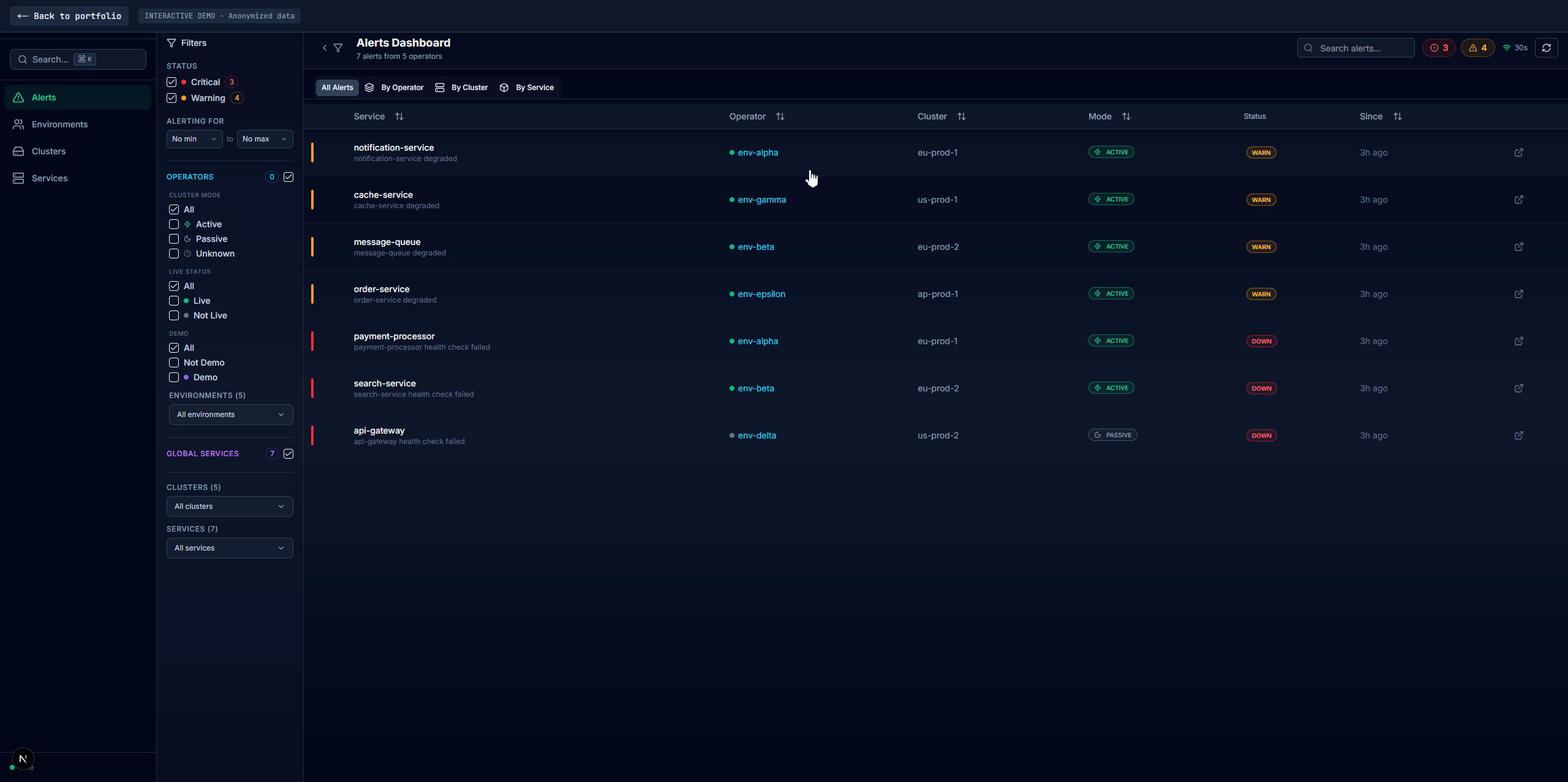
Alerts
The default landing page. Shows every failing and warning service right now across all environments. This is what on-call engineers open first.
This tab isn't a replacement for real alerting (that goes through vmalert -> AlertManager -> OpsGenie, covered in Part 4). It's a live view of current problems with more context than a pager notification gives you.
Tracking alert duration without a database required a workaround. The dashboard has no persistent storage beyond Redis cache. When a service fails, I need to show "failing for 12 minutes," not just "failing."
The solution: on each 30-second cache cycle, the worker compares current alerts against the previous cycle's alerts. If a service was already failing with the same status, it keeps the original firstSeen timestamp and increments a failCount. If it's new, firstSeen is set to now. This gives you alert duration and consecutive failure tracking purely from cache state, no database needed.
When a service recovers while someone is viewing its alert, the UI shows a "Resolved" banner instead of silently removing the entry. Filter selections persist in session storage so they survive navigation between tabs.
Environments
Where operations teams spend most of their time. Each environment gets a page showing all its services with full dependency data from the healthchecker JSON described in Part 1.
Every service lists its dependencies, their status, response times, operation counts. Pod status shows which pods are running, their resource usage, HPA state. This view answers: "is my environment healthy, and if not, exactly what's broken and why?"
Clusters
Health aggregated by Kubernetes cluster. If you're an infrastructure engineer investigating a cluster-level issue (node failure, networking, storage), this view shows whether problems are isolated to one cluster or spread across many.
Each cluster card shows its environments with health indicators. "Cluster-A has 3 unhealthy environments, everything else is green" tells you it's an infrastructure problem localized to that cluster, not an application issue. Clicking into a cluster shows its environments with an inline detail panel.
Services
This is the cross-cutting view. Instead of looking at health per-environment or per-cluster, you look at health per-service across all environments.
The services list page shows every service with filtering:
- Service type: environment-specific vs global services
- Environment/Cluster: narrow to specific environments or clusters
- Status: show only failing, warning, or healthy
- Active State: active production clusters, passive standby, or both
- Live Status: whether an environment has active traffic (from business API)
- Text search: filter service names in real-time
Clicking a service shows it across every environment it runs in, side by side. Each environment appears as a card with health status. You see patterns immediately: "payment-api is unhealthy in environments A, C, and F, but healthy everywhere else." That narrows the investigation from "something is broken" to "something specific to these three environments is broken."
This view has its own cascading filters for environment, cluster, status, and active state so you can narrow down within a single service's cross-environment data.
The Service Detail Panel
One component that appears across all four tabs. When you click a service anywhere in the dashboard (in alerts, in an environment, in a cluster, in the services list), the same detail panel opens with multiple tabs:
- Overview: health status, failure summary, warnings, and actionable insights
- Pods: every pod's status, restart count, error messages, which dependencies are failing per pod
- Dependencies: full dependency tree with status per dependency, failed operations, failed validations
- Metrics: embedded Grafana dashboards with pre-populated variables
- Logs: service logs from VictoriaLogs, searchable by namespace and cluster
- JSON: raw healthchecker response for when you need the complete picture
This is the level of detail that metrics alone can't give you. You're not looking at a graph line going down. You're looking at "pod-3 is failing because the postgresql dependency has 12 failed operations in the last minute."
The Grafana embedding deserves a mention. Dashboard variables (cluster, namespace, service, pod) are passed as URL parameters so panels load with the right context automatically. Before this, going from "this service is unhealthy" to "let me see the actual metrics" meant switching to Grafana, finding the right dashboard, and manually filling in variables. Now it's zero clicks.
Cascading Filters
Every tab uses cascading filters. The filters are interdependent: selecting a cluster filter updates which environments are available. Selecting a status filter updates which clusters are shown. Each filter narrows the options in the others so you can't end up with invalid combinations.
Active filters appear as removable pills. Stats update in real-time to show filtered counts vs totals (e.g., "3/12 environments" when filtering). All filter state is persisted in URL parameters, so you can share a filtered view with a colleague during an incident.
The Search
With hundreds of environments and thousands of services, browsing isn't practical even with good filters. The search is the fastest path to any piece of data.
It's powered by Tier 3 of the Redis cache: sorted sets. Every service name, environment name, and cluster name is indexed for prefix matching. When a user types in the search bar, a ZRANGEBYLEX query returns matches in sub-millisecond time regardless of total entry count. No Elasticsearch, no full-text search engine. Just a Redis sorted set that scales to any size.
The search opens with Cmd+K (or Ctrl+K), matching the pattern most developers expect from tools like VS Code, Slack, and Linear.
Try It Yourself
There's a live demo of this dashboard running with anonymized data. Everything described in this post is interactive:
Launch the Status Dashboard Demo
Things to explore:
- Alerts tab: see the live failure list with duration tracking and severity indicators
- Environments tab: click into any environment to see its services and dependencies
- Clusters tab: see health aggregated by cluster with inline environment drawers
- Services tab: pick any service and see it across all environments with cascading filters
- Service detail panel: click any service anywhere to see the full detail with Overview, Pods, Dependencies, Metrics, Logs, and JSON tabs
- Search: hit
Cmd+Kand type any service or environment name
The demo uses a static snapshot of real (anonymized) health data, so the structure and data shapes are identical to production.
What I'd Do Differently
I'd add shareable deep links earlier. During an incident, someone finds a useful state in the dashboard and wants to share it with the team. Right now they have to describe where to navigate. A direct link to that exact view with all filters applied would save time when it matters most.
I'd also make the cross-environment service comparison more prominent. It's under the Services tab, but it's one of the most useful views during investigations. Making it accessible from any service detail panel (a "see this service everywhere" button) would reduce clicks.
What's Next
- Part 4: From Health Logs to Grouped OpsGenie Alerts covers how the same health data powers alerting with grouped notifications and automatic silence management.